


Positioning is one of the most important concepts of UI development and design. When developing a web interface, there will be times when you would require elements to jump out of the document flow and magically appear somewhere else on the screen. This task is achieved using CSS position attribute.
In this article, we will look into several ways we can position our elements using the position attribute.
There five are positioning types in CSS:
Static positioning
Relative positioning
Absolute positioning
Fixed positioning
Sticky positioning
Static Positioning: This is the default positioning on every HTML element. Applying static positioning to your element will cause no change in the position i.e. the element remains at its place in the normal document flow, nothing out of the box. The first paragraph in the following codepen has a class of test. Try adding
.test{
           position: static
      }
to the CSS and notice that nothing changes.
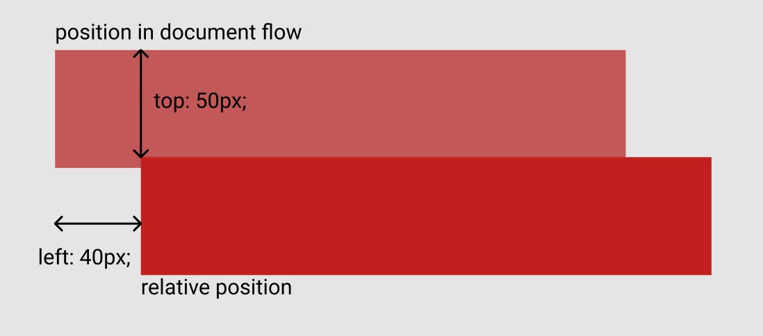
Relative Positioning: As the name suggests, relative positioning places the element relative to its position in the original document flow while reserving the original position. Let's take an example to understand this line.
Addposition: relative; to the .test selector. With this line, the position of our element has become relative to its original position. But we haven't provided any details regarding the relation. To do that we have four values top, bottom, left and right. They determine the relative position of our element. Try adding
top: 50px; left: 40px;
to the same element. The following image shows the significance of these values:
Absolute Positioning: In this positioning, the element is taken out of the document flow and is placed relative to the containing block. By default, the element is placed relative to the root element or element. In order to position it relative to some other block, we will have to add
position: relative to one of its ancestors.
Try adding
position: absolute
      top: 50px;
      left: 40px;
under the .test selector. The element is now taken out of the normal document flow and is placed relative to the containing block.
Try making the div containing our element relative by adding
div{ position: relative }. Now the element will be positioned relative to our div element.
Note: Also check out z-index .
Fixed Positioning: In this method, the elements are positioned relative to the current viewport of the user rather than any particular element or block of the markup. This allows websites to have navbars and menus fixed to the screen enhancing the user interaction.
Try adding
h1{
position: fixed
}
to the CSS and try scrolling the page. As you can see, the h1 element becomes positioned to the current viewport and is no longer a part of the normal document flow.
Sticky Positioning: A sticky element acts like a relatively positioned element until we have scrolled past its threshold, after which it acts like a fixed element. This effect can be used for navbars as well as scrolling indexes.
Try adding position: sticky; top: 0; to the .test selector and try to scroll past the element. The element sticks on top of the viewport. Note that you need to specify at least one of top, bottom, left and right for the sticky position to work.
References:
developer.mozilla.org/en-US/docs/Learn/CSS/.. (I used their format quite extensively in this article, do check them for more knowledge) w3schools.com/cssref/pr_class_position.asp
Also try: w3schools.com/cssref/playit.asp?filename=pl..
Link to the above Codepens collection: codepen.io/collection/VYKjGk